UI/UX Design: Research, Prototyping and Design Systems That Ship
How we approach UI/UX design: research that changes decisions, flows before screens, prototypes tested with real users and a design system that survives handoff.
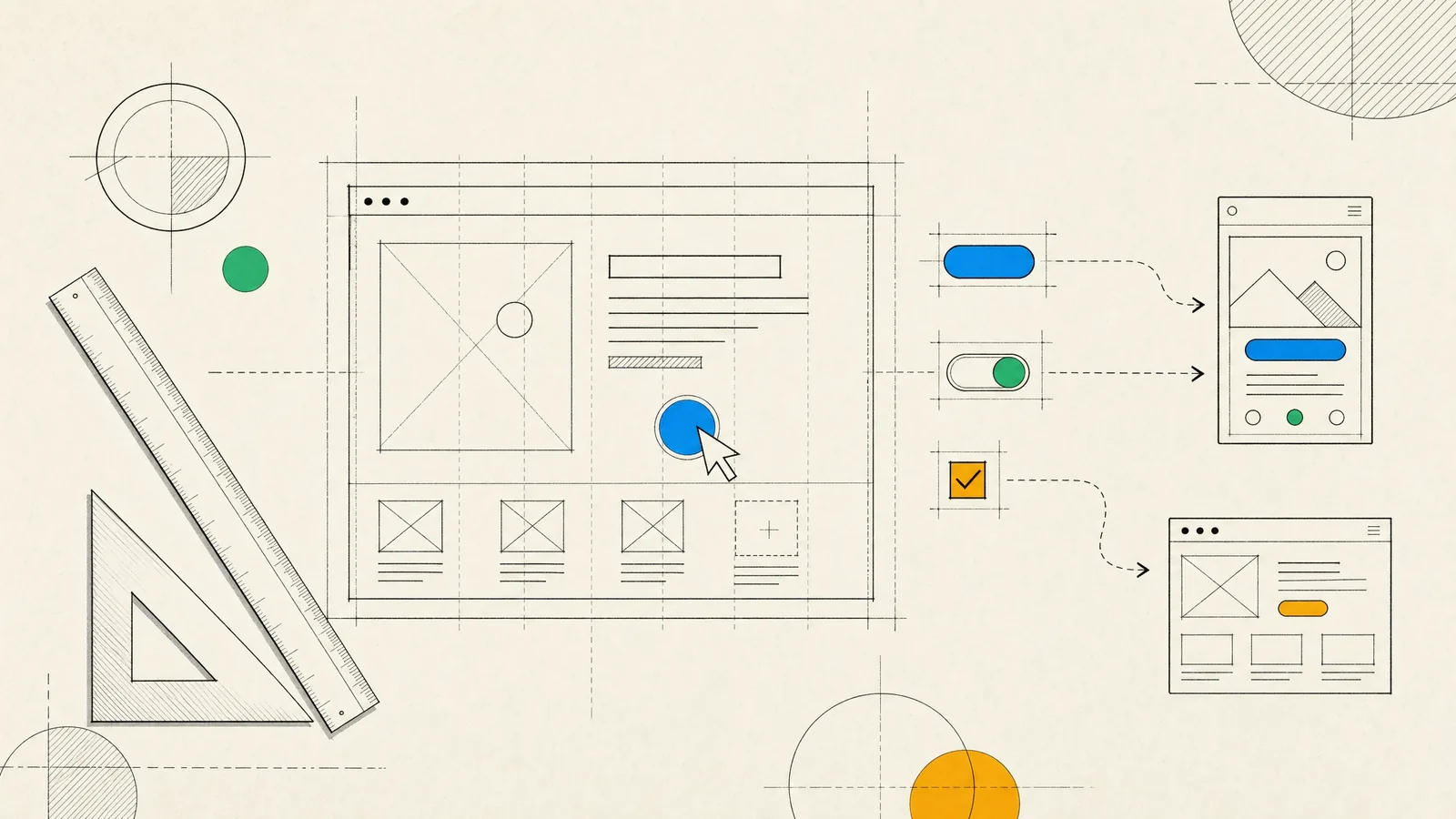
You want a product people can use without a manual, and a design your engineers can build without guessing. Good UI/UX design gets you both. It starts from what your users are actually trying to do and turns that into flows and screens where the next step is obvious. It ends with a design system and specifications precise enough that what ships matches what was approved.
The results show up in numbers you already track. Fewer support tickets come in about the same screen, more people finish onboarding and fewer checkouts get abandoned. The rest of this article walks through how we get there, from research and prototyping to usability testing and the handoff to engineering.
What UI/UX design covers in our projects
We treat UX and UI as two layers of one job. UX is the structure: what the product does, in what order, what information each screen needs and what happens when something goes wrong. UI is the layer people see and touch, meaning layout, typography, color, components and motion. Neither layer can make up for the other. A polished interface on a confused structure still fails, and a careless interface makes even a sound structure feel untrustworthy.
Typical work includes:
- Mobile apps for iOS and Android, from onboarding to settings, designed alongside our mobile app development team.
- Web applications and SaaS dashboards with dense tables, filters, roles and permissions.
- Internal tools and back offices, where a few saved clicks per task add up across a whole team’s day.
- Sign-up, checkout and payment flows, where every unnecessary field costs completions.
- Redesigns of existing products, done flow by flow instead of as a risky big-bang relaunch.
The domain shapes the design. In FinTech the priorities are trust and error prevention, which means confirming amounts, explaining fees and making irreversible actions feel irreversible. MedTech needs clarity for people who may be tired or unwell. IoT products have to show device state truthfully, including when a device is offline. And LegalTech tools are judged largely on how well they handle long, dense documents.
Research that changes decisions
Before we draw anything, we look at what the product needs to achieve for the business and for the people using it. Research is only worth doing if it can change a decision, so we size it to the questions that are really open.
- Stakeholder interviews surface goals, constraints and the business rules that will shape every screen, and our business analysts document them as we go.
- Interviews with a handful of users from each main audience focus on what they do today rather than what they say they want.
- Existing evidence often shows where people get stuck before we run a single session. Analytics funnels, support tickets, app store reviews and sales call notes are all worth reading.
- A heuristic review of your product and your competitors separates the conventions users expect from the patterns worth rethinking.
What comes out is short and practical: the main user groups, the tasks they need to complete, the assumptions still to be tested and a prioritized list of problems. We write it so the whole team will actually read it.
Flows, information architecture and prototypes
We design flows before screens. A user flow maps every step, decision and branch in a task such as signing up, adding a payment method or inviting a teammate. It’s the cheapest place to find missing steps, dead ends and permission problems, and it shows engineers early on which states they’ll need to support.
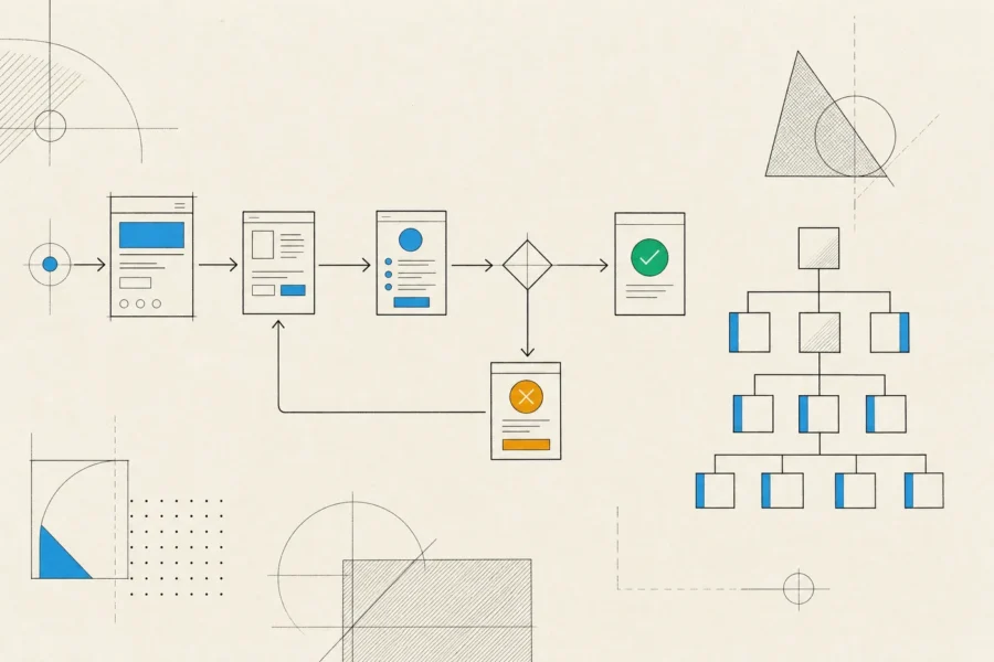
Information architecture comes next: what lives where, what it’s called and how people move between sections. For content-heavy products we use card sorting to learn how users group things. Tree testing then checks whether they can find them in a proposed navigation, before any visual design exists.
Then come wireframes and prototypes, deliberately in that order. Low-fidelity wireframes keep the discussion on structure instead of colors. Clickable prototypes in Figma let people experience the flow on a real phone or laptop. When the interaction itself is the risk, as with a gesture-heavy mobile screen or a data grid with thousands of rows, we prototype in code, because a static mockup can’t tell you how it will feel.
Throughout, we design with real content and with every state a screen can be in. That includes empty, loading, partial, error, offline and no-permission states, very long names, and translated text that runs longer than the original. Products tend to break in exactly these places, and designing for them costs far less than patching them later.
Usability testing and accessibility
We test designs with real users before they’re built and again after launch. Small rounds with a handful of participants are enough to expose the serious problems, and several quick rounds between iterations teach you more than one large study at the end.
- Moderated sessions, remote or in person, where participants work through realistic tasks and think aloud.
- Unmoderated tests for quick checks on a specific screen, label or piece of copy.
- First-click and tree tests for navigation and naming questions.
- Post-launch evidence from funnel analytics and, where your privacy policy allows, session recordings with sensitive fields masked.
We treat accessibility as part of the design rather than an audit at the end, with WCAG as the reference. In practice that means sufficient color contrast, visible focus states, touch targets sized for real thumbs and labels that VoiceOver and TalkBack can announce. Layouts have to survive larger text sizes, and motion has to respect the reduced-motion setting. Accessible products are easier for everyone to use, and in many markets accessibility is a legal expectation as well.
Design systems and the handoff to engineering
A design system is the shared vocabulary between design and engineering. It has tokens for color, typography, spacing, radius and elevation, a library of components with their variants and states, and guidance on when to use each. It keeps a growing product consistent and makes new screens faster to design and build.
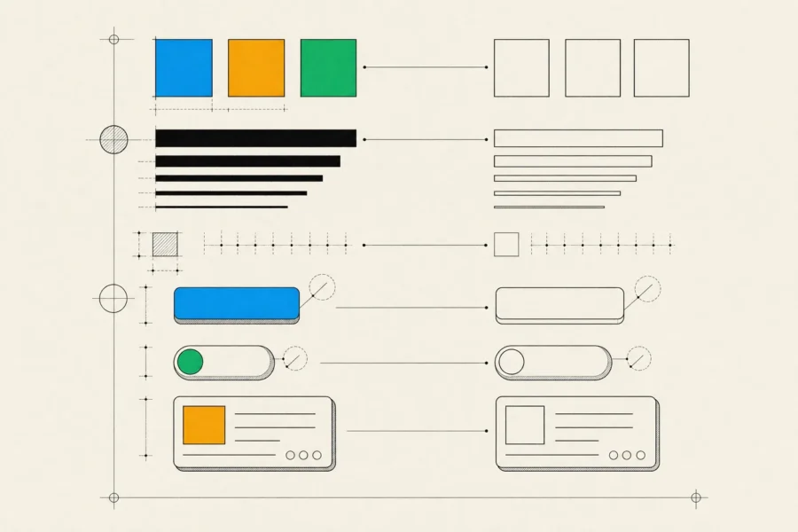
We start from the platform, following Apple’s Human Interface Guidelines and Material Design where users expect native behavior, and let the brand come through in color, type, illustration and tone. The identity from our branding work, or your existing one, becomes tokens rather than hard-coded values. That’s what makes dark mode, theming and accessibility fixes manageable later. Components in Figma map one-to-one to components in code, be they SwiftUI views, Jetpack Compose composables or React components.
All of this has a cost. A full design system is real overhead, and an early product that changes shape every week doesn’t need one. For an MVP we set up tokens and a small core of components, then grow the system as patterns repeat.
Many of the gaps between an approved design and shipped software open up at the handoff, so we make the handoff continuous:
- Engineers review flows and prototypes early, while changes are cheap, and flag anything costly or risky on a given platform.
- Every screen is annotated with its behavior: states, transitions, validation rules, error messages and the analytics events to track.
- Business analysts turn flows into acceptance criteria, and our QA testers check builds against them.
- Designers review builds on real devices before release, and visual defects get logged like any other bug.
Having designers and frontend engineers on the same team pays off most here, since questions get answered the same day instead of waiting for the next weekly meeting.
How a design engagement works
You can work with us on design alone, or as part of a dedicated product team that takes the product from idea to launch. A focused design engagement is led by a product/UX designer, with a business analyst for requirements and an engineer who reviews feasibility. In a full product team, the same designers stay on through development.
We keep cycles short, each ending in a regular review, and the work lives in shared Figma files you can open at any time. We also keep a written record of decisions and the reasons behind them. Depending on scope, you receive:
- A research summary with user groups, core tasks and open assumptions.
- User flows and an information architecture map.
- Wireframes and clickable prototypes.
- A UI kit or design system with tokens and documented components.
- Usability test findings with recommended changes.
- Annotated, developer-ready specifications.
Sometimes the right recommendation is to do less. If you need a campaign page live next week, a full research phase is the wrong tool, and a proven layout with clear copy will serve you better. If users leave because the app is slow or unreliable, a redesign won’t fix that, and the budget belongs in engineering. We’ll say so when that’s the situation.
Frequently asked questions
Do you design iOS and Android apps separately?
We design one product with one design system, then adapt it where the platforms differ: navigation patterns, back behavior, system controls, typography and permission prompts. Users get an app that feels at home on their device, and you don’t have to maintain two unrelated designs.
Can you improve our existing product without a full redesign?
Yes, and it’s often the better option. We audit the product, rank problems by their impact on users and the business, and fix them in order, starting with the flows that carry the most traffic or revenue. Changes ship incrementally, so each one can be measured.
How long does the design phase take?
It depends on scope. Redesigning a single flow takes weeks, not months. For a new product, we design the first release up front and then keep design a step ahead of development, so design never turns into a long phase that blocks the build.
Which tools do you use?
Figma for flows, interfaces, prototypes and component libraries. Code prototypes when the interaction matters, and remote testing tools for usability sessions. If you already have tools and files, we work inside them.
How do we know the design worked?
Before designing, we agree on success measures such as task completion, time to finish a core task, drop-off in a funnel or support volume on a topic. The handoff includes the analytics events needed to measure them, so the answer comes from data rather than opinion.
If your current product is harder to use than it should be, or you’re planning a new one, let us know what your users struggle with today. We’ll suggest where design work would make the biggest difference.