iPhone App Development: Product and UX Decisions That Matter
The product and UX decisions that shape an iPhone app: one-handed design, the first minute, notifications and widgets, payments and subscriptions, and real-world reliability.
People use their iPhone in brief, interrupted bursts: in a queue, on a train, one-handed with a bag in the other hand. iPhone app development is mostly a series of product decisions about those moments, such as what the app shows in its first few seconds, what it asks for, when it interrupts and what it leaves out.
In a good iPhone app, the core task is a few taps from launch and permissions are requested only when their value is obvious. Notifications are useful enough that people leave them on, and the paywall feels fair. The engineering underneath, from architecture to release process, is covered in our guide to iOS app development. This article sticks to the product and UX choices that are specific to the phone.
What people actually do with iPhone apps
We build iPhone products for startups and established companies alike. The list includes consumer subscription apps, FinTech apps for balances, transfers and card controls, and shopping and ordering apps. It also covers companion apps for IoT and MedTech devices, messaging and community features, and mobile tools that let teams approve, report or inspect on the move, connected to your existing systems.
They share a usage pattern. Sessions are short and often cut off by a call or another notification. Many interactions never open the app at all, because a notification action, a Lock Screen widget or a Live Activity is the interface. We design phone products around that pattern rather than around a desktop idea of what a session is.
Designing for one hand and the first minute
One hand, small screen
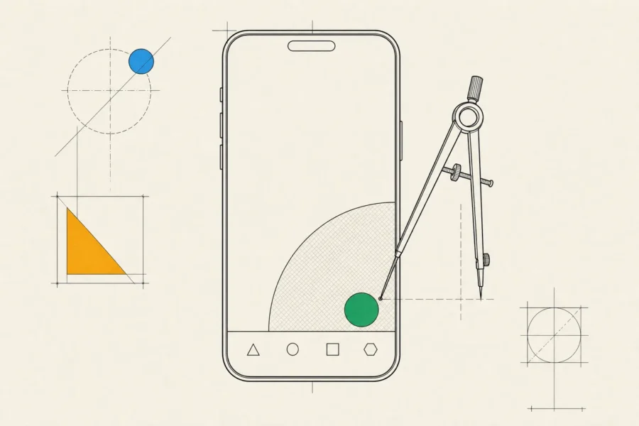
- Primary actions sit in the lower half of the screen, within reach of a thumb. Top-level navigation belongs in a tab bar, secondary tasks in sheets that can rest at partial height, and list actions in swipe gestures instead of a toolbar along the top edge.
- The same layout has to work on the smallest supported iPhone and on the largest Pro Max, around the Dynamic Island or the notch, with the keyboard open. We test on the smallest device first, because that’s where layouts break.
- Many people read with larger text sizes. Layouts that assume one size fall apart at the accessibility sizes, so we design stacked alternatives for them up front.
- Standard navigation, lists, buttons and sheets come with accessibility, Dark Mode and right-to-left support, and they follow along when Apple refreshes the system’s look. With heavily custom components, each of those refreshes turns into a redesign project.
- Each field gets the right keyboard, and content types let iOS fill in names, addresses, passwords and one-time verification codes. Every character people don’t have to type helps conversion a little.
Onboarding, sign-in and permissions
Let people see value before you ask for anything. If the product can show real content before an account exists, it should. When an account is needed, passkeys and Sign in with Apple remove the password step entirely. If you offer Google or Facebook login, App Review requires an equivalent privacy-friendly option anyway. And if people can create an account in the app, they must also be able to delete it there.
Permissions need the same care. iOS typically shows each permission prompt once, and if people decline, the only way back is through Settings. So we ask in context, at the moment a feature needs it, and the declined state gets designed as a real screen instead of a dead end. A few platform details change the product:
- The system photo picker needs no photo library permission at all, so most apps that let people choose a picture never have to ask.
- People can share an approximate location instead of a precise one. When they do, features should degrade gracefully rather than nag.
- Provisional authorization delivers notifications quietly to Notification Center without a prompt, which lets people judge them before deciding.
- The App Tracking Transparency prompt is required only if you actually track people across other companies’ apps and websites. Many apps don’t need it and shouldn’t show it.
Beyond the app icon: notifications, widgets and Live Activities
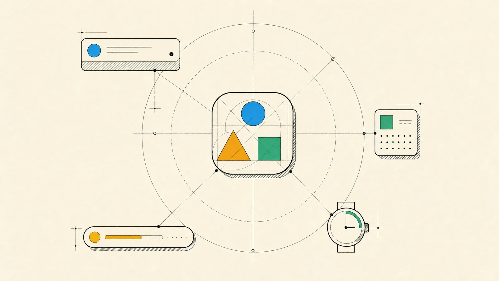
Some of the most valuable surfaces on iPhone sit outside the app:
- Notifications with actions (approve, reply, snooze) let people finish the job from the Lock Screen. Interruption levels matter: Time Sensitive should mean it, and critical alerts need a special entitlement from Apple. A notification service extension can attach images, or decrypt payloads that arrive encrypted, before anything is displayed.
- Widgets on the Home Screen and Lock Screen show glanceable state, and through App Intents they handle simple actions such as ticking off a task. They render from a timeline with a refresh budget, so they suit state that changes predictably.
- Live Activities fit anything with a start and an end, like a delivery, a ride, a match or a workout. They update through push, sit on the Lock Screen and in the Dynamic Island, and also appear on a paired Apple Watch.
- App Intents expose your app’s actions to Siri, Shortcuts, Spotlight, Control Center and, on models that have one, the Action button. You implement an action once and it reaches all of those surfaces.
- App Clips handle a single on-the-spot task, such as paying for parking or ordering at a table. They launch from an NFC tag, a QR code or an App Clip Code, without a full install.
For moments that are shorter still, the wrist may be the better place, which we cover in Apple Watch app development.
Payments, subscriptions and the rules around them
How you charge shapes the app in ways that are easy to underestimate:
- Physical goods and real-world services have to be paid for outside in-app purchase. On a phone, Apple Pay is usually the lowest-friction checkout, next to your existing payment provider.
- Digital content and subscriptions sold inside the app generally go through in-app purchase. The rules for linking out to a web checkout differ by region and have been changing, so we check the current guidelines for your markets before designing the paywall rather than after a rejection.
- Subscription state belongs on your server. App Store Server Notifications and the App Store Server API tell your backend about renewals, billing retries, grace periods, refunds and upgrades, which keeps access correct on every device, the web included.
- A good paywall says clearly what people get, what it costs and when it renews, and it offers a way to restore purchases. Vague trial terms tend to come back as refunds, one-star reviews and review rejections.
For shopping apps specifically, our m-commerce app development article goes further into catalogs, carts and checkout.
The phone in the real world
Phones lose signal in elevators and run low on battery, and they get old. We build with that in mind:
- Screens render from local data first and refresh in the background. Writes are queued and retried, and uploads use background sessions that survive the app being closed.
- Background execution is limited and scheduled by the system. Background tasks run when iOS decides, and silent pushes aren’t guaranteed, so correctness never depends on them.
- We test on the oldest iPhone you support as well as the newest. That’s where slow launches, heavy image decoding and bloated SDKs show up first.
- Location accuracy, polling and animation all cost battery, and energy and hang reports from real devices show where the app is expensive.
QA happens on physical devices in real conditions, including poor connectivity, Low Power Mode, VoiceOver, the largest text size and an interruption in the middle of a payment.
How we run an iPhone app development project
We start with product discovery, led by a business analyst and a product designer. It covers who the users are, which flows matter, what the phone gives you that a website can’t, and what the first release must include. The result is a clickable prototype that we put on real phones, in front of real users, before any production code is written.
Development is then split into short iterations. After each one, a new TestFlight build lands on your phone along with a written update. Before launch we prepare the App Store product page with you, including screenshots that explain the product at a glance. After launch, custom product pages let each campaign land on a page that matches its message, and product page optimization tests alternatives against each other. Analytics, crash data and App Store reviews all feed the backlog.
An iPhone app is the right investment when people come back repeatedly and the product uses what the phone does best: camera, location, notifications, Bluetooth, Apple Pay, NFC and a presence on the Lock Screen. For one-off tasks such as an event registration, a mobile website is the better tool, and an App Clip can cover a single on-the-spot moment. If you need Android at the same time, give a cross-platform build a serious look.
Frequently asked questions
Should our iPhone app also run on iPad?
By default, iPhone apps run on iPad in a compatibility mode, and App Review expects them to work there. Making the app properly universal is a smaller step if layouts are adaptive from the start. Our iPad app development article covers what changes.
Do we need a native app, or is a mobile website enough?
If people use the product once or rarely, a website is enough. If they come back often, need notifications, or rely on the camera, location or payments, a native app earns its keep.
When should we ask for notification permission?
After people have seen what notifications will do for them, at a moment that makes the value obvious, such as right after placing an order. For many apps, provisional authorization is a good alternative to an early prompt.
Can we take payments outside Apple’s in-app purchase?
For physical goods and services, yes, and you’re required to. For digital content it depends on the region and on the current guidelines, which have been changing. We check them for your markets during discovery.
What should the first release include?
The smallest set of features that does one core job well, plus the basics people expect: smooth sign-in, account deletion, accessibility and a sensible offline state. Everything else can wait until real usage shows it’s needed.
If you’re working out what the first version of an iPhone app should be, bring us the one task it has to handle well and who it’s for, and we’ll help you decide what makes the cut.